Revenue have launched a new site offering details on Irish property values.
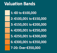
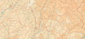
The maps are colour coded depending on the valuation bands, but the colours aren’t exactly distinctive:

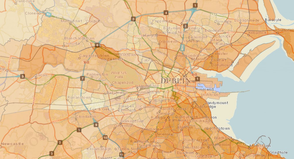
Dublin’s values are bit more colourful, but since it’s all shades of the same thing I’m not sure if it’s particularly clear:
So if your eye sight isn’t 100% or you’re a bit colour blind then I guess you won’t be able to make much use of it .. or am I missing something?
Source: The Journal


@blacknight the colours for the Cork area are stupid, cannot see any difference in the shades, maybe I should go to Specsavers !!!!!
@blacknight @mneylon Click on the map for a pop-up (at least on the mobile version, anyway)
Revenue’s New Property Value Site Doesn’t Get Colours http://t.co/uYwmEXfa9k
@blacknight Hah, said exactly that yesterday. It’s a 1970’s Carpenters album cover theme!
@blacknight @mneylon different shades of Brown, how appropriate!
@blacknight forgot to mention 1 important thing: location selection form and interactive map that does the job nicely;) i’m not a rev. empl.
@blacknight although, it’s more of a problem of that tech website :)
I get the issue about bad colours but if you zoom in & click on your street it gives you the exact value (revenue.ie)
http://t.co/qgnT18CIcV
RT @blacknight: Revenue’s New Property Value Site Doesn’t Get Colours http://t.co/uYwmEXfa9k