Akamai carries up to 30% of the web’s traffic so when they start talking about data they’re not only dealing in big numbers, but also significant percentages of the internet’s users.
They’ve made public a lot of their data and they’ve done so in a pretty visual and engaging fashion.
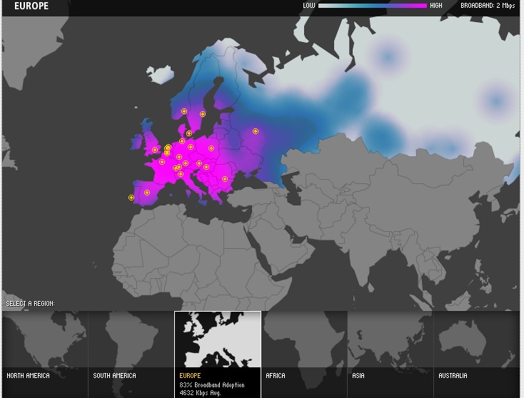
For example, here’s broadband penetration and speed in Europe:
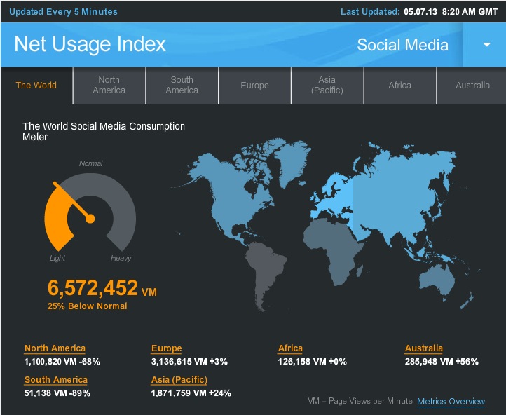
Or how about social media usage?
Here’s the current usage pattern, which is below average, probably because a lot of the world is still asleep:
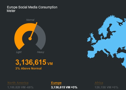
So when we zoom into Europe we see it’s actually pretty active:
You can find this and a lot of other graphs over on the Akamai site. Geektastic!





Akamai Visualise Internet Traffic http://t.co/nlMDGZw1oB
RT @blacknight: Akamai Visualise Internet Traffic http://t.co/nlMDGZw1oB
Akamai Visualise Internet Traffic http://t.co/ZbOKAejMFH via @blacknight
RT @RoxyOBrien: Akamai Visualise Internet Traffic http://t.co/ZbOKAejMFH via @blacknight