
 The choice of a typeface is usually a matter of context. What’s right for a flyer advertising a funfair is wrong for an auditor’s report. Mostly, it’s a matter of taste, and design professionals generally favour a broad palette of fonts, but for many years there has been broad agreement on one point: it’s never OK to use Comic Sans.
Introduced by Microsoft with Windows 95, Comic Sans was designed as a fun font, for informal use, reminiscent of comic book lettering. It was especially appealing to ordinary, inexperienced users, many of whom were exploring the possibilities of desktop publishing for the first time, as it stood out among the other font options. It began to show up everywhere, and not just in flyers for funfairs.
For those with more developed visual sensibilities, and Mac users, it was as if the barbarians had entered the city. Comic Sans and its users are widely ridiculed, especially as the font is often used inappropriately in serious contexts. But even if the context is appropriate, many argue that the font is ugly and that better options exist.
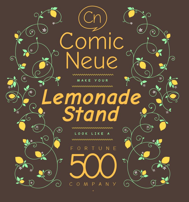
Now a new font has emerged which may succeed in pleasing the amateur enthusiasts without offending the experts: Comic Neue. According to its developer:
Comic Neue aspires to be the casual script choice for everyone including the typographically savvy.
The squashed, wonky, and weird glyphs of Comic Sans have been beaten into shape while maintaining the honesty that made Comic Sans so popular.
It’s perfect as a display face, for marking up comments, and writing passive aggressive office memos.
Comic Neue is the first typographical project of graphic designer Craig Rosynski and it’s available to download for free.


@blacknight http://t.co/m58L4JPDCp #Itvs6no
RT @blacknight: People Won’t Laugh at You for using Comic Neue, Maybe: http://t.co/IPuF65UiAL
Designers RT @blacknight: People Won’t Laugh at You for using Comic Neue, Maybe: http://t.co/EL5uHexzGe
RT @blacknight: People Won’t Laugh at You for using Comic Neue, Maybe: http://t.co/IPuF65UiAL
People Won’t Laugh at You for using Comic Neue, Maybe http://t.co/BUvp4k6wIr via @blacknight
RT @blacknight: People Won’t Laugh at You for using Comic Neue, Maybe: http://t.co/IPuF65UiAL