
When it comes to politics, the story’s in the data, and it always has been. Interpreting “the numbers” has traditionally been the preserve of a priest-like caste of tallymen and vote managers, who possess the ability to read the raw code of The Matrix.
For the rest of us, understanding data comes down to how it’s presented. And it doesn’t get presented much better than this. It’s clear at a glance that the response to the proposal to scrap Seanad Éireann shows a clear urban-rural divide.
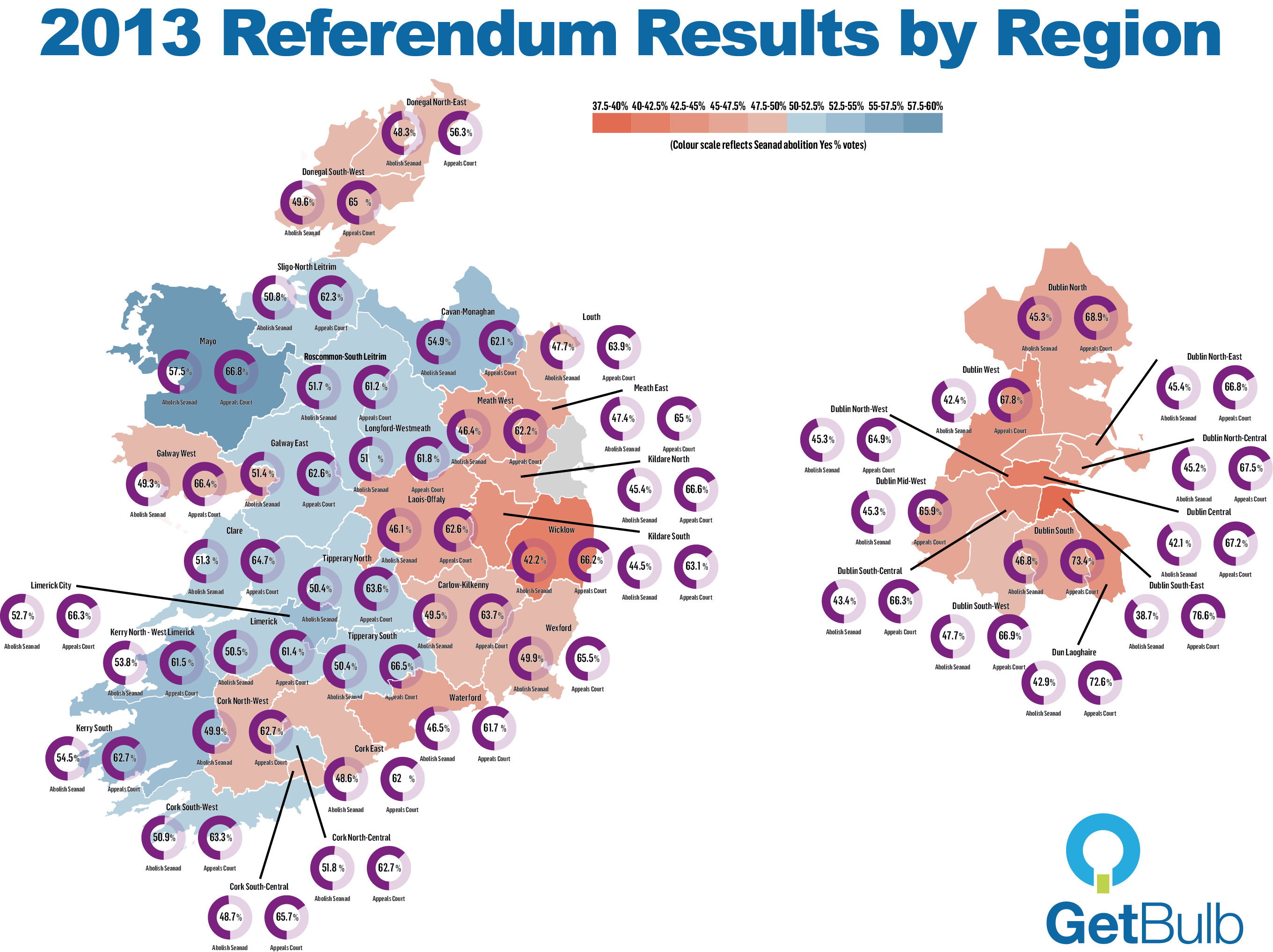
What that means, we’ll leave to sociologists and political pundits to discuss. We just like the pretty pictures – and as geeks we’re interested in the technology used to create them. It’s done using GetBulb, a Dublin startup which allows you to create cool infographics by simply pasting data into a template.
GetBulb are winners of the Irish Times Digital Challenge and have been in private beta for several months. I’ve signed up for an invitation to try out the service and we’ll have more about it on Technology.ie in the coming weeks.
Related articles


Visualise the referendum result thanks to @GetBulb http://t.co/oXgFyjLVoK via @blacknight, cc @janeruffino
RT @conn: Visualise the referendum result thanks to @GetBulb http://t.co/oXgFyjLVoK via @blacknight, cc @janeruffino
@conn @getbulb @blacknight Oh, thanks! and thanks @genemurphy for the RT!
Thanks to @conn @blacknight for this post about us on technology.ie http://t.co/Ndquj1PMJw (shameless plug, we know).
@janeruffino @getbulb @blacknight @genemurphy :) Nice work!
@conn @getbulb @blacknight @genemurphy Thanks! BTW, we have a corrected map (purple circles for Dongeal/CN/MNGHN are wrong — will send!)
Map is updated now above. thanks
OMG – It jumps right out at you when you see the graphic. http://t.co/oXgFyjLVoK Which is the only 1 of 4 major cities without NUI college?
RT @blacknight: Getbulb Breaks Down the Referendum Result http://t.co/sgUCESuJe8