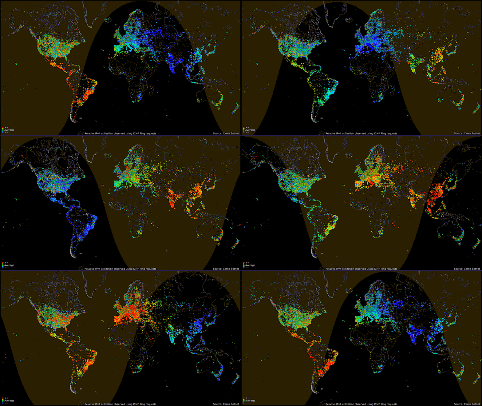
Visualising internet traffic and usage is fascinating.
This graphic (via) shows internet usage by time of day and confirms that usage is higher during office hours (doh!)
While the usage patterns are interesting, what’s potentially even more interesting are the areas of the globe with little or no usage.
You can dive into Irish and EU usage patterns if you want to using data from the EU.


![39 Facts About Uber [Infographic]](https://technology.ie/wp-content/uploads/2016/05/39uber-500x383.jpg)
![10 Essential Apps for Sailors [Infographic]](https://technology.ie/wp-content/uploads/2016/04/Sailingt-500x383.jpg)


RT @blacknight: Internet Usage By Time of Day: http://t.co/Cs4o9lTTSw
Wow…Just look at India!!
RT @blacknight: Internet Usage By Time of Day http://t.co/2rSGcghRvK
RT @blacknight: Internet Usage By Time of Day http://t.co/2rSGcghRvK