Everyone loves being able to visualise data and infographics have become very popular in the last couple of years.
However being able to generate attractive graphs and graphics requires both skill and access to data.
The EU’s Digital Agenda for Europe site removes some of the pain
You can quickly and easily generate a range of graphics based on a EU-wide data or drill down to compare a subset of the member states or even a single country.
Here’s a couple I grabbed this morning:
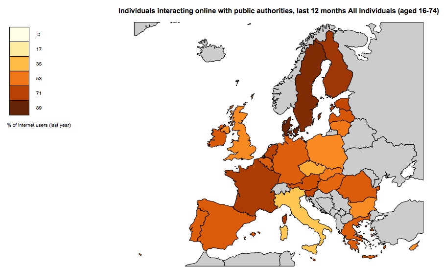
Interactions online with government
Or how about Ireland’s ranking against the rest of the EU in terms of internet usage indicators:
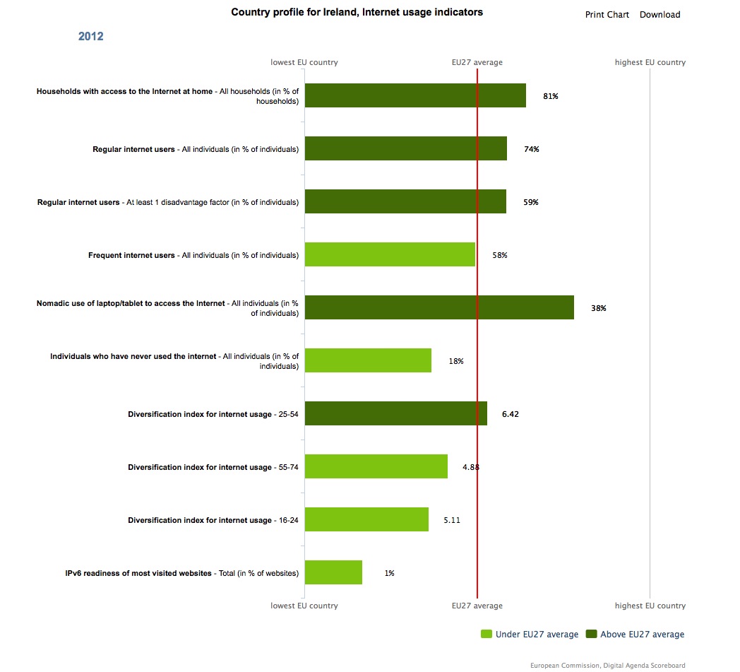
Ireland’s internet usage metrics for 2012 compared with EU member states
Or how about how the Irish public use internet services:
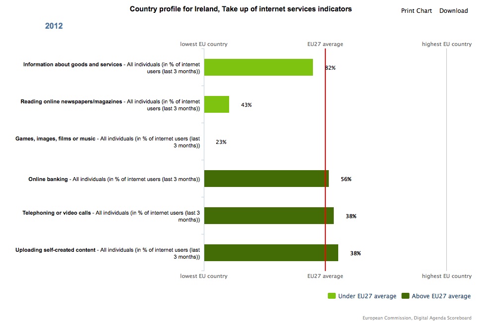
Irish take-up of on-line services
There are plenty of other metrics that you can drill into and generate some really nice and informative graphics for.


Visualise Irish & European IT Metrics Easily http://t.co/PrK7kYo5Ea #ireland #data #graphics http://t.co/uZIkJVEEMA
RT .@blacknight Visualise Irish & European IT Metrics Easily http://t.co/sMVUMb0hZc #DataViz #graphics & http://t.co/EcBn0y3VDP #RIPEstat
RT @blacknight: Visualise Irish & European IT Metrics Easily http://t.co/PrK7kYo5Ea #ireland #data #graphics http://t.co/uZIkJVEEMA
RT @Ms_Measurements: RT .@blacknight Visualise Irish & European IT Metrics Easily http://t.co/sMVUMb0hZc #DataViz #graphics & http://t.co/…
Visualise Irish & European IT Metrics Easily http://t.co/XrXEOKv3nq