Choosing The Right Infographic
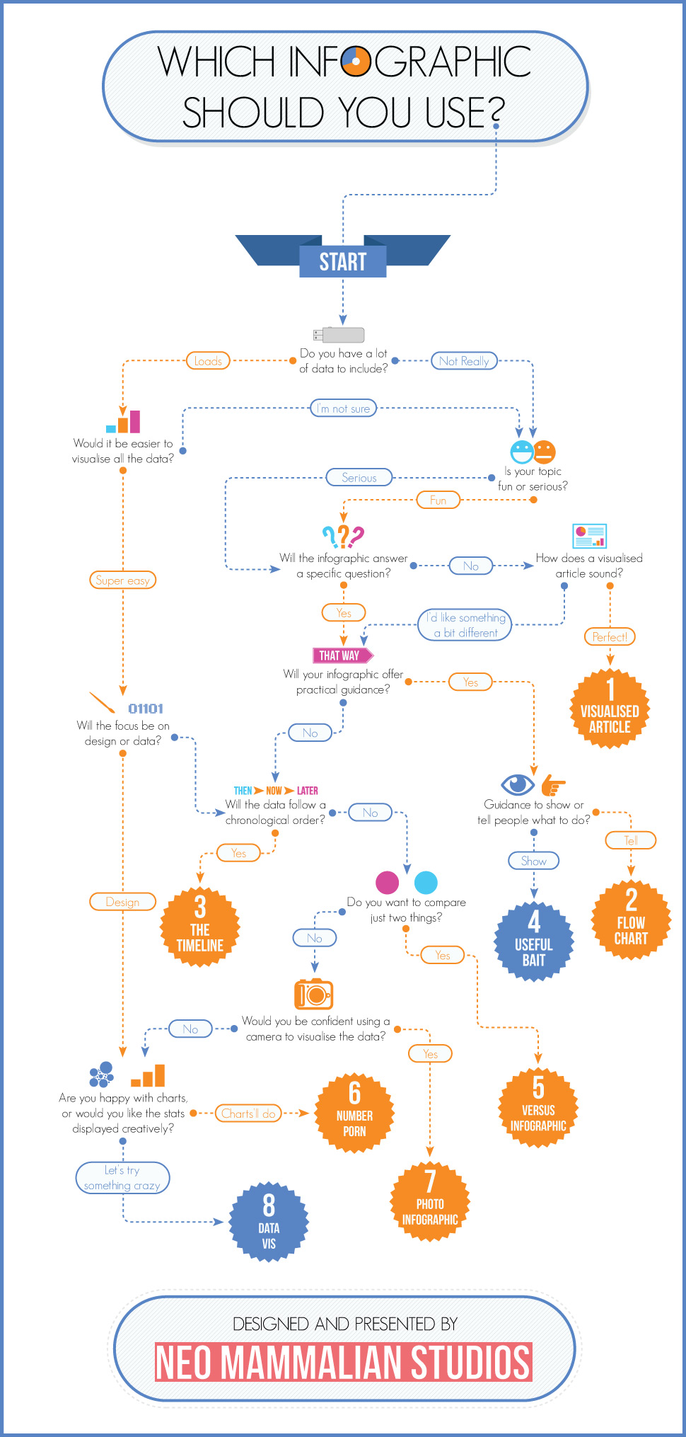
Using a graphic of some kind to illustrate a report or to make some statistics "come alive" is a good idea, but not every type of data is suited to the same type of visual presentation.
Using a graphic of some kind to illustrate a report or to make some statistics "come alive" is a good idea, but not every type of data is suited to the same type of visual presentation.