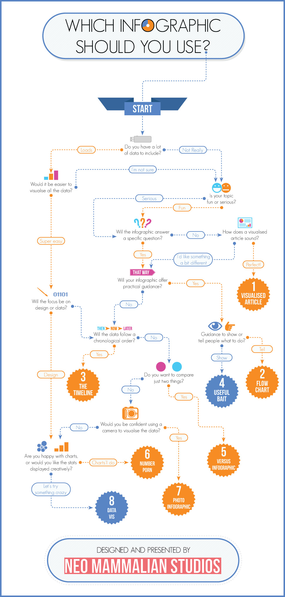
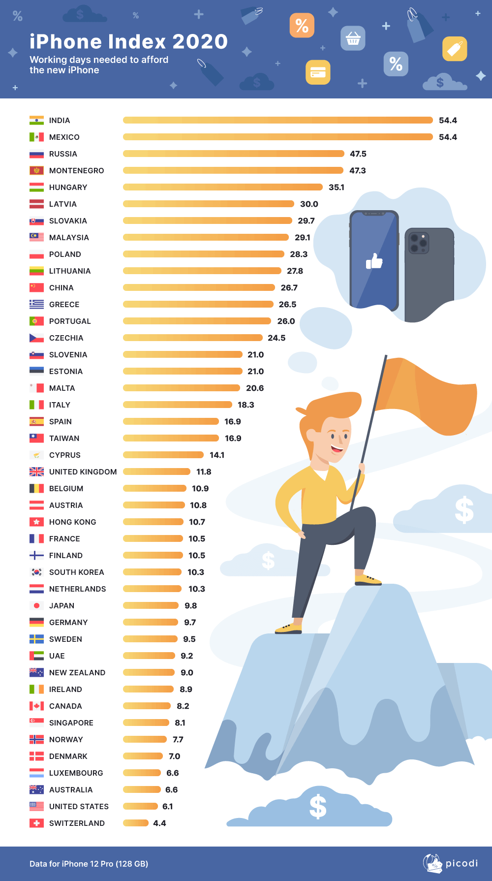
Using a graphic of some kind to illustrate a report or to make some statistics “come alive” is a good idea, but not every type of data is suited to the same type of visual presentation.
So how do you decide?
This flowchart might help

About the Author: Michele Neylon
Michele is founder and managing director of domain registrar and hosting company Blacknight. He blogs mostly over on michele.blog
![39 Facts About Uber [Infographic]](https://technology.ie/wp-content/uploads/2016/05/39uber-500x383.jpg)
![10 Essential Apps for Sailors [Infographic]](https://technology.ie/wp-content/uploads/2016/04/Sailingt-500x383.jpg)

Choosing The Right Infographic http://t.co/zjckNmIbUn