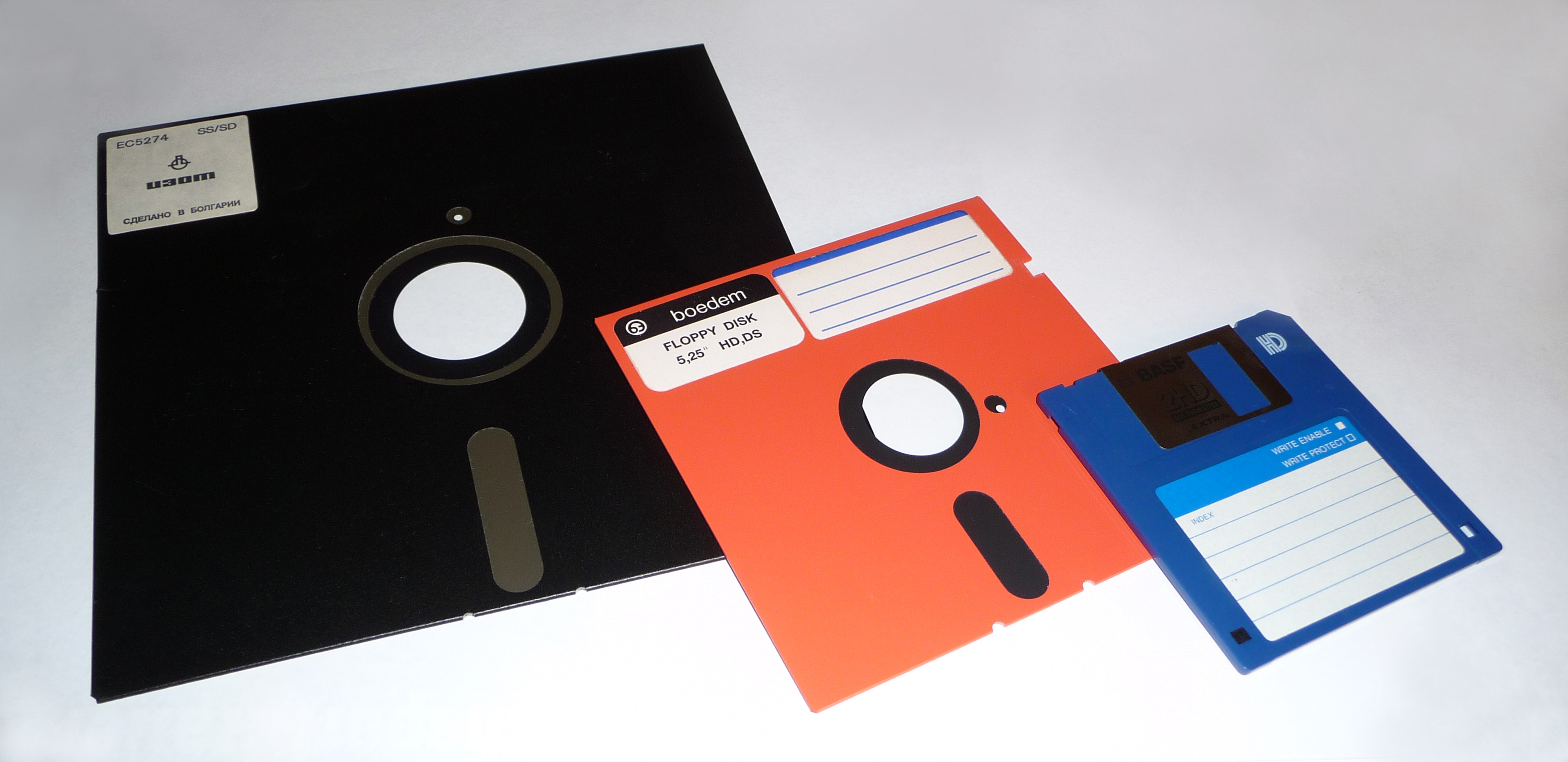

8-inch, 5,25-inch, and 3,5-inch floppy disks Русский: Дискеты: 8-дюймовая, 5,25 и 3,5 дюйма Español: Disquettes de 8 pulgadas, 5.25, y 3.5. (Photo credit: Wikipedia)
Scott Hanselman’s recent post about computer icons is getting quite a bit of attention over on Slashdot.
In his post Scott goes through some of the more commonly used icons that appear in both software interfaces as well as those of many web based services – and even portable devices such as the smartphone that you might be using to read this post.
If you’re old enough you’ll remember floppy disks, but I can’t honestly remember the last time I saw a desktop or laptop that used them. Yet the icon used to “save” a file is still the floppy disk. Is it time to change those icons? If so, what could you change them to?
If you’ve got a couple of minutes head over to his post – it’s well worth a read.
Related articles
- Icons That Don’t Make Sense Anymore (tech.slashdot.org)
- The Floppy Disk means Save, and 14 other old people Icons that don’t make sense anymore (gabrielcatalano.com)


RT @mneylon: Computer Icons Are A Bit Dated: http://t.co/IcR4A0Q8
These icons are just visual equivalents of brand words that have entered in to modem language like Hoover, google, thermos and Aspirin.
These symbols are genericised now and will be hard to shift, I’m sure there will be plenty of shitty attempts to do so that will fail in their shittyness and lack of understanding of how to capture concepts.
Another interesting aspect of floppy disks is they are called stiffy dicks in South African, imagine if that caught on, “Just click on the stiffy button.”
I’m firmly in the camp of Leave it Alone. They work, people understand.