Tag Archives | Information graphics

internet600

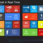
See the Internet In Real Time

Ever wondered how many blog posts were published every minute? How about how many tweets are sent? Or videos uploaded? There are several graphics doing the rounds which visualise an average internet minute, hour or day. However I’d never seen anything that attempted to visualise it in real time. This site does. Click the animation […]
Continue Reading 3
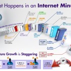
Internet Activity per minute infographic

An Internet Minute

Intel released this infographic a while back about everything that happens every minute on the internet with some projections of what things will look like in a couple of years time. The statistics are staggering, especially if you’ve been around long enough to remember how primitive the entire thing was 20 years ago (or longer […]

Continue Reading 4
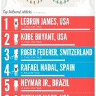
London Olympics Social Media Infographic

Olympics and Social

The London 2012 Olympics were tracked, tweeted, “liked” and shared via multiple social media platforms like Twitter, Facebook, Pinterest, Youtube and many more. The guys over at SEO.com put together a pretty interesting infographic Related articles London 2012 Olympics: social media by the numbers (thesportsbank.net) Summer Games Social Stats – The ‘Olympic-Sized Consumption’ Infographic Predicts […]

Continue Reading 5