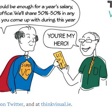
Naomi’s Graphical Harvest from the ITLG Forum
Naomi Fein from Think Visual was at the ITLG conference in Limerick yesterday. Here's her graphical 'harvest' from the event:
Drawing the ITLG Forum – with Think Visual
Naomi Fein from Think Visual is at the ITLG Silicon Valley Global Forum here in Limerick today. Think Visual use graphics to tell the story of an event. The conference was formally opened by President Michael
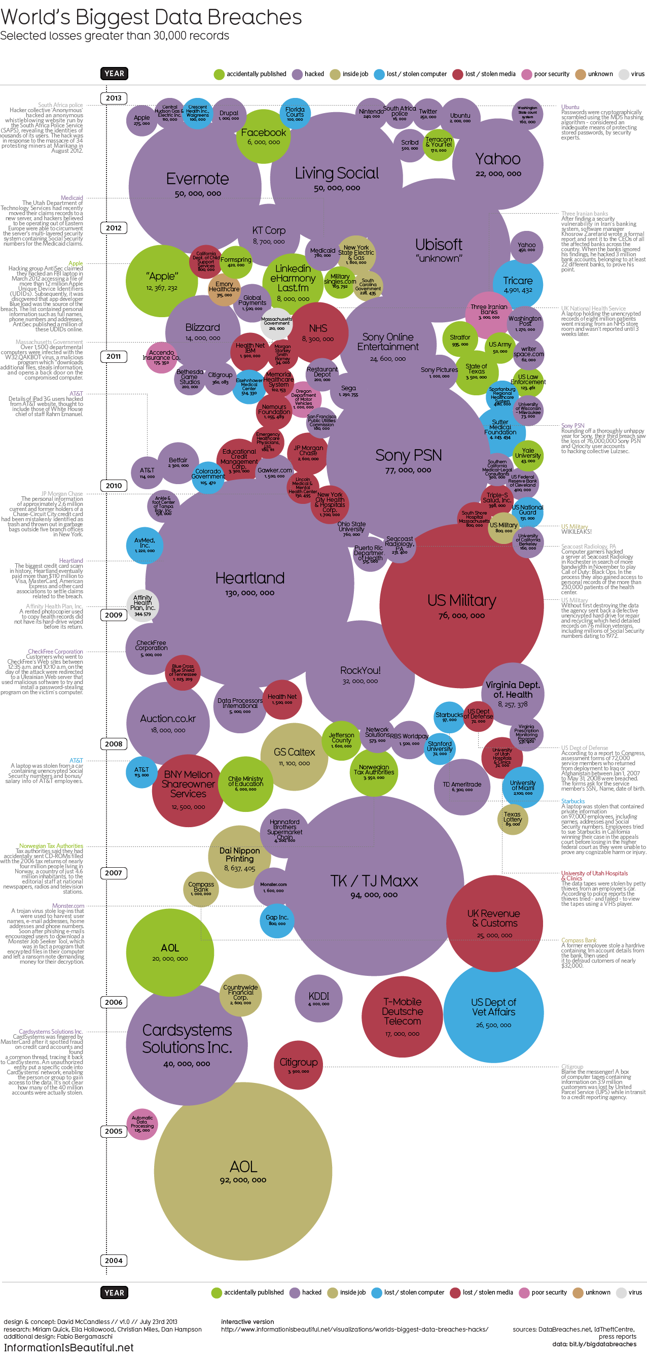
World’s Biggest Data Breaches – Infographic
Here's an interesting infographic that lists and ranks some of the more recent data breaches. It's somewhat US-focused (does not include Loyaltybuild) and not quite up to date (Snapchat?) but interesting nonetheless. There's a cool interactive
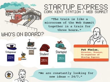
Geeks on a Train – The Infographic
It was just a 3 hour train journey, with 180 people in four carriages, but it was intense! Expect to see a lot of media over the next few days from Startup Express. I counted 4

Getbulb Breaks Down the Referendum Result
When it comes to politics, the story's in the data, and it always has been. Interpreting "the numbers" has traditionally been the preserve of a priest-like caste of tallymen and vote managers, who possess the ability to
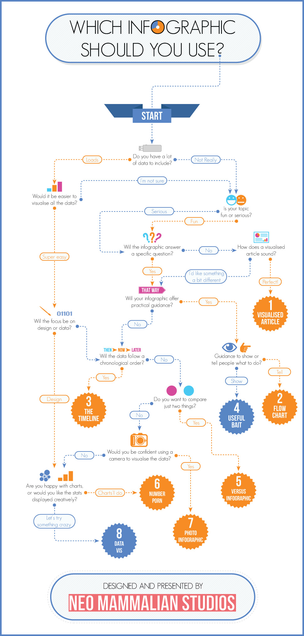
Choosing The Right Infographic
Using a graphic of some kind to illustrate a report or to make some statistics "come alive" is a good idea, but not every type of data is suited to the same type of visual presentation.