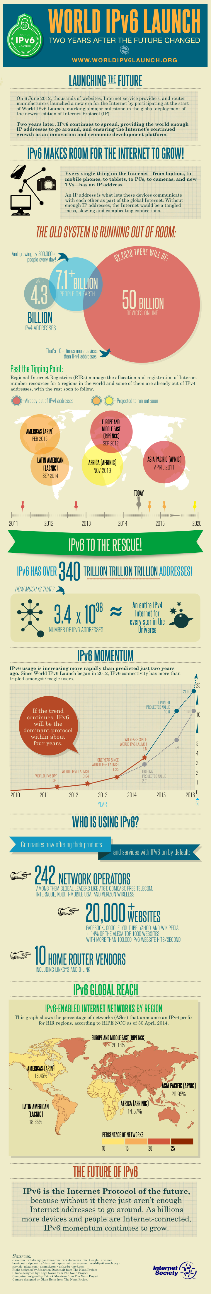
Graphic: IPv6 Adoption – Where Are We At?
Via ISOC, here's a nice clear graphic showing global IPv6 adoption, growth and other metrics: Unfortunately, as it's global, it doesn't go into enough detail to show how few ISPs in some countries actually offer
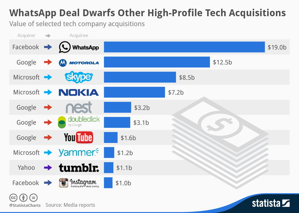
WhatsApp Acquisition In Perspective
While the announced acquisition price for WhatsApp is significant (ok, let's just say "huge"), how does it compare to other tech industry acquisitions? Here's a nice chart from Statista that puts it in context
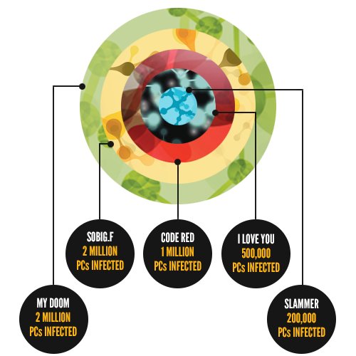
Five Most Catastrophic Viruses of All Time [Infographic]
If large scale computer virus epidemics seem like a thing of the past, it's only because we've learned the lessons of vigilance. Software updates, firewalls and anti-virus mean that outbreaks on the scale of these five
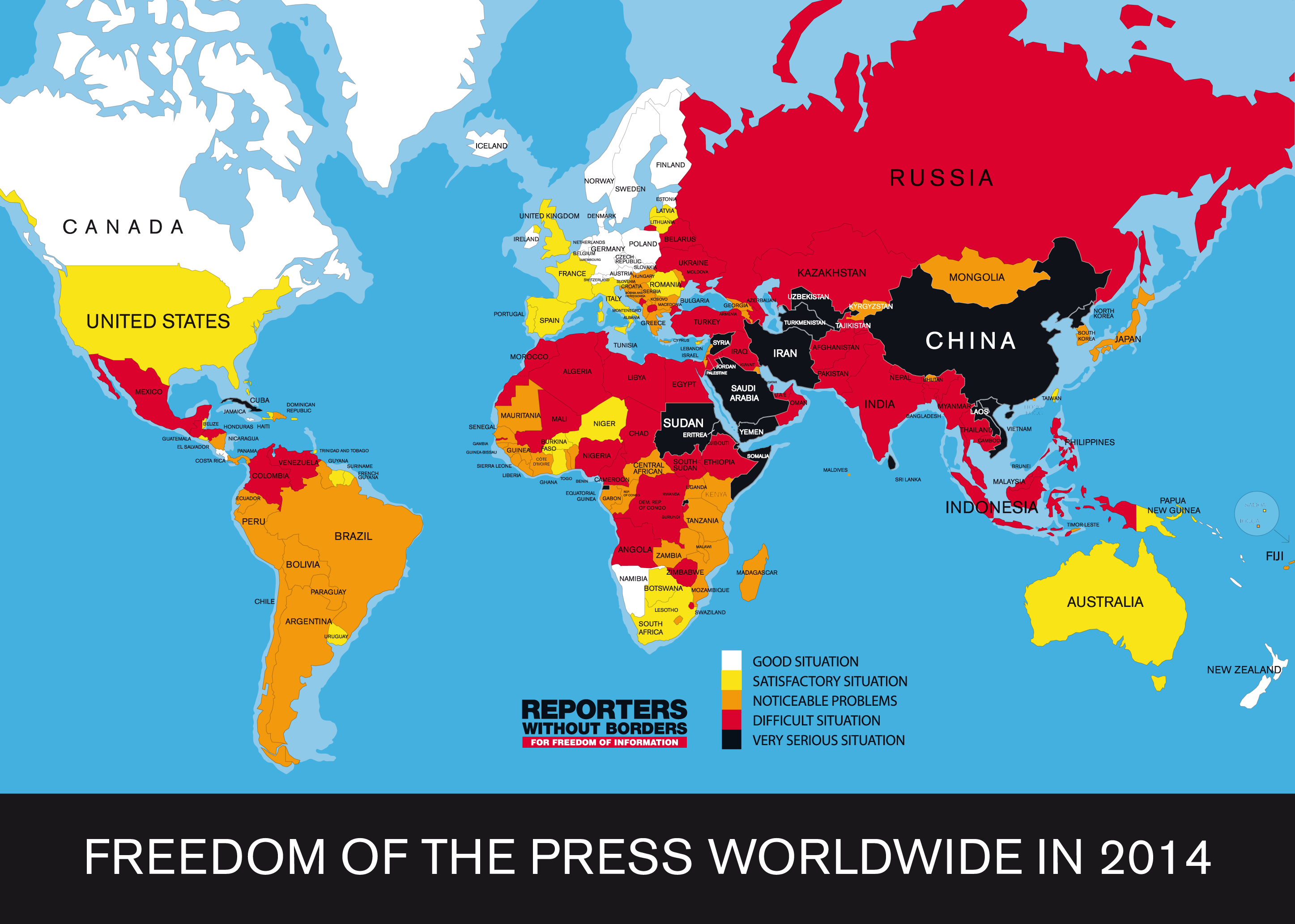
How Free Is Our Media?
Freedom of the press is an important metric. And while Irish media have been discussing how much freedom there is versus the risk of legal issues, the overall ranking of Ireland's media isn't that bad. The
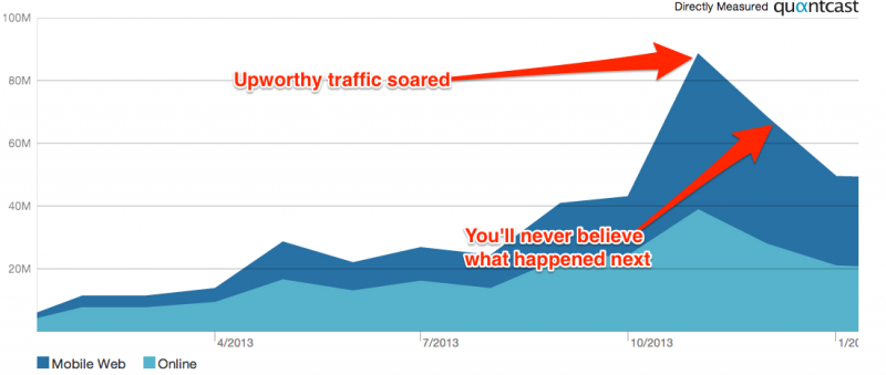
What Goes Upworthy Must Come Down
Back in December we wrote about how Upworthy, the good news, fluffy, heartwarming, annoying, viral video meme site was dominating interactions (likes and shares) on Facebook. So have you seen as many Upworthy videos lately? Me
Ireland in Top 10 for Internet Speed
Ireland ranks 10th in the world for average internet connection speed according to the latest research by content delivery company Akamai. Akamai have published their State of the Internet Report for Q3 2013. With an average